Welcome to Big Macro Picture

Find out more about our unique approach to Market and Economic analysis across different timeframes.

US ECONOMY (January 10th 2013): US Markets for 2013

Comprehensive US market and economic analysis for traders and investors in 2013...

What You Can Expect From Us

An explanation of the sort of articles and analysis you can expect from Big Macro Picture.

Big Macro Picture 2011 - Insight into "How We Analyse"

2011 was one hell of a year to be in the markets. Perfect for us to show you what we do. Check out our week by week analysis for 2011, to demonstrate how we view economic and market trends.

Big Macro Picture - 2012 So Far

To get the most out of our daily articles, please check out our week-by-week analysis of 2012 so far. Continuing on directly from the 2011 review, we get you up right up to speed, giving context to the rest of our 2012 analysis up to early June 2012.

Tuesday, 16 October 2012

US ECONOMY (October 16th 2012): Capacity Utilization Rate


The US Capacity Utilization Rate is an indicator to be respected.

Very few monthly economic indicators show long term trends in the US economy quite as simply as the CUR. It is exceptionally useful for providing noise-free, long term bullish and bearish cycles in the US economy, when viewed on longer timeframes.

If I had to give a complete novice ONE MONTHLY INDICATOR to describe how the economy is broadly doing, without noise or complications, I'd give them Capacity Utilization.

While it isn't a leading indicator, it is simple to use, and simple to understand the main trend. As you can see below, it is very effective for identifying different phases in economic conditions.


Charts Courtesy of Forex Factory

On the first chart, we can tell from 2000 to 2012 how broad cycles of expansion, contraction and consolidation take place. Unlike some of our other favoured indicators for month-to-month analysis, there are very few anomalous results - and there is little in the way of hyperbole or hysteria. Just big, broad, smooth trends in the US economy, which anyone could use to determine economic trends.

As we pointed out, unlike our other favoured indicators, this one is not a leading indicator - but rather, serves as long term confirmation of economic trends, without much fuss. We would never use CUR for instance, to try and pick out what the market is doing this month or last month - the easiest way to understand it is to check it out and play with it yourself:

US Capacity Utilization Rate (Forex Factory Chart)


SO WHAT IS CAPACITY UTILIZATION TELLING US NOW?


We can use US CUR as a confirmation indicator, to help us identify what part of the economic cycle we're in. We can use the trend to show us whether we want to be allocating capital towards businesses or not, via the equities market.

We know that over the course of several months, or even over a year, Capacity Utilization will consolidate at "mature" stages of a long term bullish or bearish cycle. It will also trend upwards, or downwards, in the middle of bullish or bearish cycles.

For instance, between 2006 and 2007, Capacity Utilization flattened out, before beginning to fall at the start of a new bear market. In 2002, like many economic indicators, it flattened out before recovering in 2003 - the start of a new bullish run for stocks. In 2009, it sharply turned around and confirmed we had entered a new expansionary bullish phase.

Only two months ago, in August, Capacity Utilization made new multi-year highs. However, in September and October, CUR fell quite sharply. At 78.0% and 78.3%, these are the two worst readings of 2012 so far.

What does this mean for our current cycle?

Well, pulling a chart up since 2009, the trend is clearly up. And while 78.0% and 78.3% are the worst two readings of 2012, they are still better than any number we saw in 2011. So we're clearly not in a confirmed bearish downtrend phase for the US economy at this time.

What it does mean however, that compared to January's 78.6% reading, the indicator has made zero progress in 2012 based on the last two readings, if the year ended now.

That compares with 2009: troughed at 68.1%, December reading at 71.5% (new trend high)
2010: January at 71.9% (the year low), December reading at 75.4% (the year high)
2011: January at 76.2% (the year low), December reading at 77.8% (2nd highest of year)

Considering Capacity Utilization was at 78.0% in November 2011, we can be suitably concerned that little progress has been made judging by September and October 2012's numbers.

We know it is not uncommon for this indicator to reflect weak medium term conditions, and 2012 has seen economic weakness from March throughout the summer. Given the advent of QE3, we would not be surprised to see CUR recover and make new highs in the coming months, and re-affirm the 2009 bullish trend. However, our point is, we'll have reasons to be worried if September/October's reading is not a blip.

If CUR does not continue making new highs, and plateaus at around this level, we would be concerned for the ongoing health of the 2009-present expansionary phase for US business conditions. At the very least we would have to acknowledge the maturity of the current cycle, perhaps similar to 2006.


AND WHAT ABOUT IMPLICATIONS FOR INVESTORS?


This is somewhat trickier to discuss.

Being a % indicator, Capacity Utilization oscillates between values of 0 and 100, depending on how much industrial capacity is being utilised in the United States. It does not account for the efficiency, productivity or technology being utilised in that space, or the profit (in dollars) that each company is making.

Perhaps most importantly, it says nothing about the valuation of businesses, only the trend in an ongoing cycle.

So as a stand-alone investment tool, there are obvious limitations, something that stretches to plenty of economic analysis.

However - in this market from 2000 onwards - identifying and understanding these patterns has been crucial to allocating capital.

In the absence of technological advances, deregulation or other "secular bull market triggers", earnings-multiple valuations have been generally suppressed in stocks, while the Dow has ranged between about 7k and 15k.

Timing has been extremely important - and that timing has depended on effective analysis of economic cycles. The US Capacity Utilization Rate has been one of the most sound indicators out there during that time for identifying those bull and bear markets.

So, whilst we remain in that environment, we feel it is important that equity investors pay close attention to whether or not - over the course of 2012/2013 - the US Capacity Utilization Rate returns to its bull market trend of higher highs.

At Big Macro Picture, we'll keep you up to date with our analysis of this indicator, what it's telling us about global macroeconomic trends, and what it could mean for global equity markets.


Thursday, 11 October 2012

US ECONOMY (October 11th 2012): US Jobs and Unemployment Improvment As We Approach US Election? Believe the Stats, is the Recovery Real?


With the US Presidential election just weeks away, the various US unemployment statistics have come into very sharp focus from the wider public and mainstream media. The economy, we're told, will be the most important factor as American voters head to the polls to elect either Mitt Romney or re-elect Barack Obama for a second term.

Democrats might, in that case, be flooding Federal Reserve Chairman Ben Bernanke's mailbox with Christmas Cards this year, as the Fed's latest QE program could be helping the US economy just in time for the election.

We say that with the release of today's Unemployment Claims, a dramatically improved multi-year low, far better than analysts had estimated - possibly the earliest sign that QE3 has begun helping the US economy.


We'll add a few caveats here - firstly Unemployment stats are prone to revision, seasonality formulas, data outliers, and are not the best natural leading indicators for the economy. However, the overall trend in Unemployment Claims is a useful one, as we can correlate "improvement phases" with good returns in equity markets, and more broadly bull/bear markets when claims fall over time.

From March 2012, we stopped seeing a material improvement in US Weekly Unemployment Claims - something that contributed to our view that a medium term "bearish phase" had begun for the US economy, likely to last several months.

We consider that bad trend for US economic data to be over, and that the market already reflects data materially improving (as today's data suggests) between now and the end of the year courtesy of QE3. This data release is perhaps the first to reflect that properly - the lowest reading since the 2009 bull market began, and a return to the overall "falling" trend in Claims.

Let's see how this compares with the other US Employment stats from last week, including the highly controversial 7.8% Headline Unemployment Rate.


Check out the problems we have with Unemployment stats in general here.

In short, we think Non Farm Payrolls are overrated as an economic indicator, that ADP is often a better reflection of economic trends, and that the Headline Unemployment Rate is not very useful for investors.

So much has been written on the 7.8% Unemployment rate this week, including claims that the BLS have somehow altered the statistics to favour Barack Obama and the Democrats. We simply don't believe those conspiracy theories, on grounds of realism and lack of motive. Also, because the Unemployment Rate is a fairly lousy indicator for whether the economy is going in the right direction.

Just take a look at the Unemployment Rate chart. It's telling us that the US economy has been in an expansionary phase since late 2009. That's something we could have told you in early 2009. We don't want to find out that the Titanic is sinking when the Band is already playing on deck and the hull is pointing in the air - we want to know as soon as we hit the iceberg, and preferably a lot sooner than that. Our message is - look at the indicators which work, and not the ones which consistently lag the others.

Our other Unemployment statistics, ADP and Non Farm Payrolls, certainly reflect that unlike May, job growth isn't sliding anymore. There isn't a downtrend in job growth - but there isn't much of a recovery trend yet either. This is why today's data is so important - it is the first sign that these indicators will likely start getting better as 2012 comes to a close.


SO WHAT DOES THIS MEAN FOR INVESTORS, AND THE ELECTION?


We don't like getting into politics much at Big Macro Picture, and try to remove as much political spin as possible from how data is reported. This writer, for one, has no vote in the US election (I'm British) and has a very moderate, sceptical view when it comes to politics on a whole.


However, we cannot deny that the US election is an important event for the market, as is the ongoing state of the US economy.

Assuming today's Unemployment Claims figure is not a massive outlier and isn't revised dramatically higher, it could be foreshadowing an improvement in other economic indicators in the coming weeks and months. For the election, it might mean Obama's chances improve, if American voters really look at economic data.

For investors, we reiterate what we have said previously.

QE3 really needs to work for the 2009-present bull market to continue. The market has already looked forward, anticipating not only we'd get QE3, but that it would work.

This could, possibly (it's not 100% guaranteed), be a sign that QE3 will work - or at the very least, that something has caused the US economy to continue its 2009 trend of improvement.

However, from June onwards, we need to keep in mind the market has been pricing this in, without really pausing for breath. Now we have noise in the market from backwards-looking earnings, reflecting all the poor conditions we knew about a few months ago.

So, while the green shoots of real economic improvement are there, we do need to keep in mind that technically the market may want to retreat based on election uncertainty and tough earnings from earlier this year. A lot of improvement is indeed priced in.

Should we get a material retreat in equity prices, and data does indeed improve, we may wish to increase exposure to stocks without chasing risk.


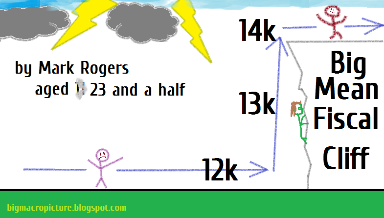
In the meantime, please enjoy this detailed alternative graphical perspective of the Fiscal Cliff issue, which we believe tackles the contrarian aspects of investment, the "wall of worry" investment thesis, and a market-oriented psychological analysis of how the market might approach such a economic significant event, in a way that differs from the consensus viewpoint.


Saturday, 6 October 2012

EQUITIES MARKET ANALYSIS (October 6th 2012): How we use the Bullish Percentage Indicator, What is BPNYA saying about the Rally?


HOW WE USE THE BULLISH PERCENT INDICATOR

 
Readers of our 2011 and 2012 (so far) Reviews will notice we like to use the Bullish Percentage indicator in our analysis for MEDIUM TERM market trends.

2011 was a notoriously difficult year for attempting to manage portfolios in the face of volatility. While we're big fans of using trends in Economic Analysis to assist us, the BPNYA alone might have offered the following guidance last year: 


  • 1) From Q3 2010 onwards, maintaining an increasingly bullish stance
  • 2) From February-April 2011 adopting increasing caution, perhaps consider taking some profits
  • 3) From May-October, revert to being net short, protect downside risk or avoid buying stocks
  • 4) Consider adding to long term holdings in extremely oversold August and early October conditions
  • 5) Gradually ease back in and buy on the dips between October and early 2012
BPNYA from Q3 2010 (after QE2) troughing in July, bullish from September
BPNYA warning us in March 2011, falling to oversold levels and then recovering by 2012


This is of course written in hindsight and perhaps should be treated with skepticism - but the Bullish Percentage Indicator (BPNYA) in 2012 continues to help investors navigate difficult market conditions. At the very least, it helps to indicate how sentiment is evolving in the overall stock market on a month-to-month basis.

BPNYA, the NYSE Bullish Percent Index, is a 0-100% value demonstrating the percentage of NYSE stocks with a "Bullish" Point and Figure char signal. In other words, what % of the broad NYSE market is bullish, and how is that changing over time?

There are many different interpretations for this indicator - at Big Macro Picture, we have a unique way of using it. The Weekly BPNYA chart helps us classify MEDIUM TERM bullish or bearish cycles, which might last anywhere between 3-9 months. Keep in mind those cycles (often for instance, bearish May until September, in many years) take place within bigger LONG TERM cycles - so we can have a bearish Medium Term view within a bullish Long Term view.


WHAT HAS THE BPNYA BEEN SAYING BEFORE NOW?

We commented on the Weekly BPNYA indicator falling beneath its 20 Week Moving Average in early April this year, when the Dow was around 13000. Being a leading indicator, a sign of the overall market breadth, the market generously gave plenty of opportunities to sell between 12850 and 13300 once the signal was offered in April.

Between May and early June, the Dow fell back to a low of 12050.

The BPNYA in that time would've acted like a sober man advising a reckless friend during a night of heavy drinking.

During the giddy overindulgence of the early part of the year, the BPNYA offered some signs of warning and caution from February onwards. "He's overdoing it now", the sober man might say in March, as his friend (the market) laughed it off, ordering another round of drinks.

While the sober BPNYA has no idea when that giddiness will end, it often knows before the market when the party is over and the night is about to end. It also rarely knows how severe the "sickness" and subsequent hangover will be -- only that hysteria, overreaction and dismay are usually the emotions that come next. "I told you so", the sober man might say, handing his friend a bucket.

And 2012 has often been both exuberant (in March, and arguably now in October) and despairing (in May), where the market is concerned. A sober judge of market breadth is extremely useful while the market is weighed down by economic fears, and subsequently buoyed by central bank easing. As we've alluded to in other articles, June-present has seen a market rally that economic indicators have missed until very recently.


WHAT IS BPNYA SAYING ABOUT THIS CURRENT JUNE-PRESENT RALLY?

Our BPNYA analysis comes in varying different stages - it is an indicator capable of telling us many things about the "stage" or "mode" the market is in.

In early June, the indicator troughed, and failed to make any more lower lows. In mid-June, BPNYA crossed back above its 20 day moving average and stayed above it, the first traditional short term "buy signal" often used by swing traders.

In early August, it crossed back above the 20 week moving average - which should normally serve as confirmation that a MEDIUM TERM bear phase has ended, and a new month-to-month bull phase had begun. At that stage, we can more confidently buy dips in the US indices.

The BPNYA tends to show us trends in the market without much fuss or noise, in normal market conditions. Simply following this trend from June onwards would have yielded satisfactory results - and that trend is usually fairly clear, making striding white Marubozu candles on most weeks.

Then, in the second week of September, BPNYA crossed above the 70 level. This is an interesting point - where an investor can take two different views. The market enters a stage of exuberance when making sustained moves above 70 on BPNYA, as a considerable majority of US stocks look bullish. So our first point of view is, "don't stand in the way of the market", as the market is likely to push ahead. We might want to close short positions on dips, or temporarily shed some of our downside protection - with a view to getting better prices to do so later.

The second point of view is that when the market gets carried away, it can often become overbought, and ugly scenes can ensue if that trend changes. So, at that stage, we're also waiting for the market to run out of steam. When BPNYA flattens out, and then begins diverging/falling sharply, we know to reverse positions or take profits.


Charts Courtesy of the Excellent StockCharts.com


We can see this on the chart above - note how quickly and definitively the trend changes in early June, and how the 20 week moving average is crossed in early August.

This brings us to our crossroads point in October 2012. The BPNYA hasn't made a new high in a couple of weeks, and since mid-September has been consolidating. In 2011 and earlier this year, BPNYA spent 9-10 weeks consolidating in this way - making new Dow/S&P highs in the process - before diverging from the market and falling.

Similarly, despite BPNYA not powering into the overbought 70s levels, the Dow closed at a new cycle high on Friday. We will continue to watch the market breadth indicators for developments as it remains in this consolidation phase. If it begins to fall violently, diverges from the market, or continuously fails to make new highs along with the market, we will begin to take profits on long exposure.

On the other hand, if it makes new highs and embeds itself above the 70 level, we will continue to take BPNYA as strong evidence that the rally could continue - and that 14000 may come sooner rather than later on the Dow Jones Industrial Average.


Monday, 1 October 2012

GLOBAL ECONOMY (October 1st 2012): Resurgent Global PMIs - Old Trend is Ending, But How Much is Already Priced In?


The global PMI reports released each month from Markit, ISM, HSBC and JP Morgan, all serve as key indicators in our view of global macroeconomics trends.

PMI SO FAR THIS YEAR

It has been global PMI data which has kept us most concerned this year. On February 22nd, coinciding with a breakdown in market breadth indicators, PMI reports from Europe started to reverse their 2011 recovery - something which had been key in triggering a market rally up to that point.

Next came Japan and China, who had endured a fragile 2011 - they both began to signal further deterioration in their economic activity as 2012 progressed. Finally, most recently, the US economy completed the set by slowing down dramatically this summer.

In spite of the market's optimism (fuelled by forward-looking solutions to this economic slowdown by central banks), we continued to cite the poor economic data - and expressed doubts over the Fed's willingness to launch QE3 before the US Presidential election. Once QE3 was announced, we acknowledged that the market could now "ignore" present conditions, feeling that the data would start to improve by the winter - while at the same time expressing the risk of market disruption if QE3 did not work by then.


THE NEW PMIs THIS MONTH

So, with the market now "guessing" that QE3 will produce a positive outcome by the end of 2012, we're left waiting to see what the data does in the meantime. While we might be too early to see the effects of the Fed in today's ISM Report, the ECB's actions in the summer were greeted with satisfaction from the market -  are those actions being reflected in better economic data?

And what about the effect of the Euro dramatically strengthening against the dollar in recent weeks? Would it be negated by an improvement in economic activity? We take a look at data from some of the most important economies in the world:


Let's start with China - posted 47.9 in September, up slightly from 47.6 in August. It's still below 50 (deteriorating), and New Export Orders fell disastrously to multi-year lows. This is still quite a bit worse than earlier this year, and as manufacturing exports are a huge part of the Chinese economy, we have good reason to take notice. However, on a positive note, the trend hasn't gotten worse this month. We're not told anything new about the Chinese economy - it continues to slow, but neither more or less dramatically than last month. The more "official" version of PMI, released this morning, reflecting the same scenario.


Japan - improved to a three-month high of 48.0 in September (August: 47.7), although still below the 50 mark. The report cites the over-valuation of the Yen as a significant factor. Japanese PMI remains weak, without too much improvement. We can be encouraged that like China, it failed to make a lower low in that trend, but in both cases we will want to see another improvement next month.


Russia - improved to a four-month high of 52.4 in September, up from 51.0 in August. In shocking contrast to the rest of the world, this report argues the potential for monetary tightening in Russia. The report cites the impressive growing domestic demand within the Russian economy - and of course, the softening of any international trade slowdowns, courtesy of a robust energy export market. While we cannot really draw global conclusions from Russia's PMI reports, it is interesting to see a strongly-performing economy without as much correlation to the rest of the world.


Spain - improved from 44.0 to 44.5. The epicentre of ongoing European concerns, economic conditions in Spain are extremely relevant in 2012. August, September, and now October have seen very clear signs of improvement in the Spanish economy, from a very low base. Between mid-2010 and mid-2011, the Spanish economy stagnated. From mid-2011 onwards, along with the rest of the world, the Spanish economy worsened - at a very worrying rate of decline between March and July 2012. The improvements in the last three months show a justification for a rally that began with Mario Draghi and the ECB. The recovery in Spanish 10yr yields reflects this quite clearly - we will hope to see this recovery continue into 2013.


Italy - climbed to a six month high of 45.7 in September, from August’s mark of 43.6. The Italian economy has shown less convincing signs of recovery than Spain this summer, stagnating around the lows for 2012. While there isn't a "recovery trend" to speak of, this month's jump up to six month highs is reflective of the good news coming from peripheral Europe. While we don't wish to comment on whether ECB policy is "working", the data is certainly better in September than a few months ago.


France - recorded 42.7, down from 46.0 in August, the worst reading since April 2009. This is a frankly disastrous report. Worryingly for France, a lot of this was down to domestic woes, a loss of confidence in the French economy, and the postponing of new orders in France. This led to the backlog of work being severely depleted, a bad sign for the French economy going forward. Low demand in France can be attributed to many things, but low business confidence perhaps relates to French fiscal policy under President Hollande.


Germany - 47.4, up from 44.7 in August. In contrast to France, a massive improvement in operating conditions and business confidence, despite the strengthening Euro. A very strong report, including a commentary suggesting that perhaps the German economy has troughed in its negative 2012 trend. The improvement in confidence came mostly domestically, although with the rest of Europe still slowly recovering, this might not be much of a surprise. Almost all headline indicators saw an improvement - a very important sign for the German, European, and Global economy.


UK - edged lower to 48.4 in September, from 49.6 in August. A messy indicator, not helped by an independent currency, which has strengthened considerably against the dollar this month. The UK saw its sixth month of decline in new export orders, with Europe and China showing the weakest demand. The commentary cites Europe representing 50% of UK exports, particularly unfortunate in 2012, as their biggest customer struggles with confidence and demand. As with the trend in most of Europe however, domestic demand is shown to have moderately picked up.


Eurozone Composite - 46.1 in September (six-month high, up from 45.1). This broad indicator tends to give us a smooth representation of the European economy as a whole. It peaked in March 2011, troughed in December 2011, peaked again in March 2012 and has now seemingly bottomed again, troughing in August. Two months in a row of improvement signal that PMI for Europe has, on a whole, picked up significantly - even though it remains in contraction.

While in the long run we'd much rather see these PMI stats above 50, improvement is good enough while European equity prices remain relatively depressed. 2009 would be a good example of that on a larger scale after the financial crisis. Most importantly, we have green shoots of recovery, and signs that a deteriorating trend (which began all the way back in February) has concluded.

Finally, we earlier saw the release of the US Markit PMI, and the widely followed ISM Manufacturing PMI.

US PMI - 51.5 up from 49.6, a marked improvement from the rest of the summer, and a move back to expansionary levels. US Markit PMI meanwhile showed a deterioration from 51.5 to 51.1 - with both versions explicitly indicating a US economy only barely growing. The important story from our perspective though, is the improvement in one of our most respected indicators for global growth, the ISM. As we stated earlier, it will take some time for QE to truly filter into the real economy - so ISM moving confidently away from multi-year lows is a positive sign.


OUR CONCLUSIONS

With another month of PMI data, we can draw some useful conclusions as to the MEDIUM TERM trend in the global economy.

Our preliminary view is that the MEDIUM TERM bearish trend, beginning on February 22nd, is most likely over.

The wheels were set in motion for this conclusion in June, when the market began strongly rejecting oversold conditions. Our preferred market breadth indicator, the BPNYA, troughed along with the market in June. By early August it had climbed above its 20 week moving average. And now, apart from France, almost every measure of global economic relevance has moved away from previous lows - fairly confidently in the case of Germany. There seems to be a broad sense of recovery in most developed economies, especially in Europe, the epicentre of 2012's slowdown.

Unfortunately, this isn't much of a bold prediction, given the market has moved substantially away from June lows. Unlike in late February, the market has moved several months before the data improved - courtesy of central bank easing.

As we alluded to in previous articles, this makes it difficult to use fundamental or market breadth analysis to gain an advantage - in fact, traditional fundamentalists will most likely continue to be baffled by the market in this current phase. In that type of scenario, which we also saw after QE2 in 2010, "don't fight the Fed" tends to be the easiest option. It remains to be seen how the market would react if that trend of recovery falters, or if the Fed's QE3 is deemed to be failing.

As for how to best recover from being "late to the party", if we're even at the party at all? We remain cautious. However, we acknowledge that many hedge funds in 2012 have found themselves in the same position - and there will be some degree of "performance chasing" as 2012 comes to an end. While we're more convinced than last month of the "green shoots of recovery" emanating from Europe, the market has gone up considerably, increasing the risk in buying at these levels. Also, the market breadth indicator BPNYA, has spent two weeks failing to make a higher high.

So - while we're saying that the February-August bearish MEDIUM TERM period is most likely over, if a new bullish trend has begun, an awful lot of the gains have surely been priced into the market already - and we're not sure if the potential reward is high enough to be too exposed to the market. It would take either "more attractive" entry points, or a truly impressive trend of recovery (including regions China and Japan, which have been tepid at best) to be willing to add much more risk at this stage.

That said, this month's data was fairly conclusive, and in another market this might have presented a very attractive buying opportunity. Fed intervention is the kind of anomalous event that cannot be mitigated for in terms of data analysis - and "better safe than sorry" is our preferred approach to the market.


Thursday, 27 September 2012

US ECONOMY (September 27th 2012): US Housing, Is the Trade OVER? Or is this Theme just warming up?


One great distraction over the summer (with the overall market moving in the opposite direction to economic data courtesy of QE), has been the US Housing trade.

As we know, US Housing fell off a cliff in 2007-2008. It began to recover in 2009, but stalled in 2010. We've been awkwardly waiting for US Housing to get going throughout 2011, and so far in 2012 the recovery in US Housing data has gotten back into its stride.

And so with a firmly bullish view on US Housing, with prices still depressed and mainstream sentiment still rock bottom, the leading housing data has led to great long trades in the US Housing sector in 2012. The data supporting that is shown below.


As we can see, the majority of US Housing data has shown a considerable recovery in 2012, after stalling somewhat in 2010-2011, coming from a low base after the housing crisis. New Home Sales, not included in the above screenshots, shows the same trend of recovery as Building Permits and Housing Starts.

While the whole market and US economy bounced back considerably from late 2011, the trend in the US Housing recovery has been smooth, decisive and consistent in making higher highs in many of the key indicators. This compares to an often confusing, bumpy ride for the rest of the US economy in 2012.

So, what has the effect been on the XHB (SPDR Homebuilders) in 2012? Let's look at the chart below:


The greyed area coincides with the malaise of US Housing data in 2010-2011. To be realistic in how we'd see the data in real time, it would take us until at earliest December 2011 to recognise a recovery in the US Housing data, looking at the charts. February-March might have been the most realistic time to recognise a visible recovery in the majority of indicators.


If we use the breakout in February (19.40 on the XHB for confirmation), we can see it has been a highly profitable trade for data-following market participants. The most recent peak in the XHB was 26.16 - that's a 35% gain in just seven months, from that data-supported breakout. Stock-picking in particularly leveraged housing plays would have yielded even more impressive returns, and taking early trades at the start of 2012 might have returned closer to 53%.


After such an impressive run, encouraged by continually impressive data and the prospect of further QE3-specific support for the Housing recovery - has the trade become too mainstream, and is it effectively over? This has been the sentiment from many traders who called the trade correctly earlier in the year (particularly Anton Kreil, who highlighted this phenomenal trade earlier in 2012 for Marketwatch: here).


The US Housing market is still "depressed", as Fed Chairman Ben Bernanke highlighted when QE3 was announced. The XHB has more than DOUBLED in less than a year, with the Housing Recovery far from guaranteed, and improvement still at the "green shoots" fragile stage. Is it time to take profits on this excellent trade? Did it come too far too fast?

Perhaps so. The surge has been so remarkable in recent months, that many have pointed to short-covering, a scrambling for shares amongst momentum traders, and fund managers leaping aboard the "hot sector", all helping housing stocks get overheated. Naturally, in the last week, we've seen a sharp sell-off as profits have been taken. The trade has reached the point where mainstream newspaper columnists have gotten on-board, a worrying sign for savvy "fast money" traders.

But on a grander, longer term timescale, does the data still hand us a reasonable opportunity to buy on any weakness? The trade may indeed be overheated, but what about the investment, in a sector that is still by-and-large hated by the public?

Mainstream market commentators may now be twigging to the recovery, and may be giving it column inches. But if the recovery is for real, and the housing market is still depressed, is this the first stage of a multi-year cyclical move?

Warren Buffett stated at the start of the year that the best investment opportunity in 2012 could be residential housing - and not for a six month trade, but for the long-term. When we look at the low base we start from in the Homebuilding sector, we know that the SPHB index peaked at over 1300 in 2005, was slammed down to just 112 in 2008, and now sits at around 500.

Something similar happened in 2003. The SPHB rallied hard from 300 to 560 in just three short months, as the trade went from "hated" to "overheated" between March and June - like today, this was supported by data showing green shoots of recovery. The trade fizzled out and became overdone. We saw a correction of 18% in just one month, late-comers left burnt in an overcrowded trade.

We all know the rest of the story - this was just the beginning of a huge bull run/bubble for US Housing, between 2003 and 2005, from 300 to 1300 on the SPHB index in two years. The trade may have fizzled out in 2003, but after cooling off, the recovery in data was enough to put a floor under prices - and the rally resumed a few months later.


So, while we'll continue to watch the data on that apparent 2012 Housing Recovery, keeping timeframes in mind might be the wisest idea.

The trade may be overheated, and today might or might not be the time to take profits on short-term bets. But if the recovery is a cyclical, sweeping improvement in depressed bricks and mortar, we might not be too quick to write off more returns in the Housing sector as we head into 2013 and beyond.


(Naturally, past performance and behaviour is not always a reliable guide to future returns, the comparison is a simple observation).

Monday, 24 September 2012

GLOBAL ECONOMY (September 24th 2012): QE3 vs Economic Data, and Why We Won't Chase Risk


Since March 2012, global economic data in terms of quality leading indicators, has deteriorated in a strongly negative trend. The market gave us plenty of opportunities to sell the rallies once we got to this stage if we chose to. Even our leading market breadth indicators, the Bullish Percentage charts, wisely guided us to bearish conclusions in April, telling us to fade rallies and avoid buying the dips.

This broadly coincides with what you'd normally expect the market and economic data to do together. As Global PMI stats, business surveys and other (more mainstream) Unemployment stats start to peak, and fail to make higher highs, the market eventually stops making higher highs and pulls back, until the reverse is true. We usually get plenty of warning, and support from our market indicators, to allocate our portfolios appropriately.

However, the market is quite capable of ignoring economic altogether when choosing a direction. We saw this on a large scale in 2002, when the market became embedded in a negative mindset, the result of a confidence-dampening bear market from 2000 onwards. When it does this, it is often better to stand aside than attempting to pick market tops and bottoms, simply wait until the signals are stronger. In 2010, with the advent of QE2, it took at least a couple of months for the data to confirm the improvement in conditions (you'd have missed the bottom, but you wouldn't have been gambling on an unprecedented program working out).

Nevertheless, we're approaching the end of a frustrating summer for quantitative analysts, concerned with the ongoing decline in macro data from China, Europe, Japan and the United States, with Global PMI in it's worst state since 2009. Despite this, the market has surged ahead, troughing in June and rallying to new highs.

The explanation, of course, is Central Bank easing. The market knows that the Fed's actions rip up the sheets of negative economic data we're seeing today - at least, that is what the market expects. Indeed, knowing it may take three months for QE's effects to show up in the data, the market is rallying with no concern at all for economic conditions today.

At Big Macro Picture, as we've highlighted in recent months, the economic data hasn't gotten better. In fact, it has gotten considerably worse in some regions, which previously weren't a major concern. This remains to be true - although we remain glued to the data for signs of this trend reversing.

Despite this, our view is to appreciate the market's expectation of QE3's success. The last two versions of QE were constructive in reversing negative trends in US data. We don't want to follow that expectation without seeing proof in the data ourselves - the market could be set up for a considerable fall if QE fails to arrest the slump in US and Global economic conditions.

However, to draw directly bearish conclusions on the market based on today's data is not insightful, as of September 13th with the QE announcement. It isn't that the market is failing to see the poor quality economic data, it is simply reading past that, with the assumption that Global PMI will be positive again by November.

The market guessed correctly we would receive more Fed easing, and is also guessing that this easing will boost global economic conditions. Standing in the way of the market would have been unprofitable from June onwards - we feel that the reward for playing along in this guessing game is unfavourable compared to the risk.

As such, we continue to preach caution in having too much bullish or bearish exposure until the data confirms what the market indicators have been saying since June, whether QE works or otherwise. Even at the risk of missing out on further market gains, or at risk of missing a market shorting opportunity. It is foolish to overexpose yourself when the signals are conflicting, when the indicators are no longer leading the market, and when even top economists can't figure out what the real effect of QE3 will be.

It is worth noting that our favourite leading market indicator, the BPNYA, gave us the go-ahead to mark a new MEDIUM TERM bullish cycle beginning in early August. Our more sensitive version of the indicator gave us the signal to buy dips in relevant stocks from mid-June. Despite this, the conflicting bearish economic data has tempered our excitement towards the rally - and we feel no pressure in chasing performance amidst speculation and uncertainty.

Wednesday, 1 August 2012

GLOBAL ECONOMY (August 1st 2012): Declining PMI Data in China, Japan, Europe and Beyond - What Does It Mean?


Being the 1st of the month, we have a huge series of leading economic indicators being released. We'll be bringing you overall analysis along with the ISM PMI and ADP Jobs data. Until then, here's a round up of the data released this morning produced by Markit. You can find their reports here: Markit PMI Releases


PMI DATA FROM EUROPE, JAPAN, CHINA AND BEYOND


(We use this data to understand what kind of market cycle we're in, as part of LONG TERM and MEDIUM TERM categories of analysis. Below, we give a very simple summary of the first reports of the day (released before ISM Manufacturing), along with notes we wrote as the reports were released.)


Japanese PMI - 47.9 in July, down from 49.9, a new lower low and the worst in 15 months.


South Korean PMI - 47.2 in July, down from 49.4, the worst month-on-month report since this report began in 2004. New orders and new business in severe contraction for an economy which is a useful bellwether for global manufacturing. Demand seems to have fallen back further than the average summer slowdown.


Dutch PMI - unmoved at a reading of 48.9, fifth month in a row in the negative "below 50" area, where it has been pretty much since mid-2011. Interestingly for the first time since April we have export orders getting stronger, and see some benefits of lower input costs, two of the things we've been waiting for. Report isn't good, highlights awful European internal demand, but has one or two encouraging signs.


Taiwan PMI - 47.5 in July, down from 49.2. Another useful bellwether, again we have international weakness cited. "Firms signalled that demand from US, European and Chinese markets weakened. Moreover, domestic demand was also reported to be lower than that seen during June. The pace of contraction in both total new orders and new export orders was the fastest since December 2011." There's a real call for further easing from China, if the latest round of action doesn't start kicking in.


Vietnam PMI - 43.6, from 46.6 in June. This isn't a report with a great track record, but the decline is still worrying even if it lags by a month or two.


Indonesian PMI - 51.4 in July, up from 50.2 in June. As I said last month, not a great indicator, but once again is a bright spot for the global economy.


Russian PMI - improved from 51.0 in June to 52.0. It has held up really well in 2012 compared to other economies but the report shows a mixed picture, with strength in internal consumer demand but all in spite of weak export demand. Of course, this doesn't always equal a satisfying economy for Russia given their reliance on oil, but there's still a good correlation to stock market performance.


India PMI - 52.9 in July, down from the reading of 55.0. Reflecting the weaker new orders from the last month's report and power outages (worst power outage in history), nowhere near as weak as the reports from mid-2011, so refusing to really feel the same pain as the rest of the world. New export orders, the key theme through these reports, have finally declined for the first time in 9 months.


Polish PMI - recovered from June’s 35-month low of 48.0, posting 49.7 in July. Last month's report really was dire, so it's encouraging to see this economy turning that trend around somewhat. "Weak international demand linked to the Eurozone crisis continued to weigh on overall new business flows in July. The volume of new export orders declined for the twelfth time in the past 14 months" 


Turkish PMI - 49.4, down from 51.4 in June. This indicator is fairly volatile and difficult to evaluate trends. Only conclusion from the report is that conditions deteriorated modestly.


Spanish PMI - 42.3 in July, up from 41.1. Still a horrible reading, but we're looking for any signs of peaks/troughs, only comfort is that this isn't a lower low. "Total new business declined sharply again, with respondents highlighting domestic markets as a particular source of weakness. That said, new export orders also fell, extending the current period of reduction to 13 months." We find ourselves waiting for that "March 2009" moment, when dire circumstances are getting slightly less dire, and equity valuations are spelling doom. No convincing signs of that yet especially, demand is still exceptionally weak.


Czech PMI - little-changed at 49.5 from June’s 49.4. Showing some signs that it troughed in May, but it's in fairly lonesome company in indicating that. Is usually a fairly good indicator for "average Europe", so will keep an eye on this one over the course of 2012.


Italian PMI - 44.3 in July, down from June’s reading of 44.6. Another lower low in the current trend, for an economy that is very important to Europe and this situation on a whole. Any silver linings? "a marked rise in international demand for Italian-produced consumer goods", we can presume is a sign that the weak Euro is helping popular Italian brands internationally, but is not offsetting overall weak demand yet.


French PMI - 43.4 down from 45.2 in June, lowest reading since May 2009. Last month was encouraging, but this erases that and adds France back into the column titled "negative". Output and new orders shrinking. Weak demand at home and abroad, hardly offset by lower input prices.


German PMI - 43.0, down from 45.0, lowest level since June 2009. New lower low in the current trend, with new work failing to come in to replace completed projects. We know how important the German economy is to the European economy, "This is the longest continuous period of falling new orders since the 
survey began in April 1996". Big declines in Western European demand (UK and France), softer demand in the US and China. Backlogs of work are being eaten into - without this, manufacturing activity would be lighter. Whether the market does or doesn't react to this awful data in 2012, feeling uncomfortable buying equities here is surely understandable.


Greek PMI - 41.9 in July, from 40.1 in June. Hard to really gain any meaningful conclusions here as a bellwether for global conditions, Greece are in a unique kind of mess. Sharp reductions in new orders and new export orders, such is the lack of confidence and demand.


UK PMI - 45.4 in July, down from a revised reading of 48.4 in June. This is particularly bad news for the UK, worst reading in the current trend and the worst since 2009. How bad the current recession will be is unknown, but this data doesn't lend itself to an improvement in 2012. This was a moderately bright spot last month, but now is joining pretty much every major European economy in the mess.


China PMI - 49.3 in July, up from 48.2 in June, a slight improvement. We've been in the sub-50 territory since 2011 on this indicator - Chinese weakness is undoubtedly playing a part in current conditions in a way under-reported compared to Europe. Policy easing is expected before GDP growth slows further, there's a real chance Chinese growth could be lower than 4-5% if this trend continues.


Overall Eurozone PMI - 44.0 in July, down from 45.1, another lower low in the current trend. I was expecting at least some bright spots like last month, but the trends here are fairly definitive, especially coming from Germany and France.


CONCLUSIONS FROM PMI REPORTS SO FAR

While we anticipate the upcoming US PMI data will be the most significant news of the day, there are plenty of conclusions to draw from the data so far:

  • Most Major Economies Below 50 in the headline PMI reading demonstrates the weakness in global economic leading indicators. The last two major periods where global PMI readings turned negative in such a pronounced fashion were in 2000 and 2007/2008. While we cannot say how this will translate in the equities markets, we know from past record that being cautious is warranted - especially going into August, with the Dow above 13000.
  • Weaker Global Demand/New Orders is a theme that carries over from the last month in a continuing trend, with worryingly increased momentum in big manufacturing economies.
  • More Dramatic Reductions in Input Costs also carries over from the previous month's reports, with no easing effect on manufacturing conditions.
  • Backlogs of Orders are being eaten into while inventories are generally rising, most pronounced in the German PMI report. This is worrying going forward, as New Orders will need to come in to prevent further weakness in Q3, once the backlog of projects is depleted. At that stage, it is possible we'll see more pronounced job cuts in the manufacturing sector.
  • The Glimmer of Signs the weaker Euro/lower Oil Prices are helping? It may be fairly small consolation, but it's worth pointing out after such a tough time for European equities and manufacturers, the first reports have started to suggest a weaker Euro is helping push demand for certain big Italian brands with the quote, "a marked rise in international demand for Italian-produced consumer goods", although only Ireland and the Netherlands posted expansion in New Export Orders.

As posted last month, we have no interest in being permanently bullish or bearish, or pushing any agenda - only in analysing ongoing economic conditions from an investment standpoint. While we cannot be certain how the worsening conditions will affect equity market performance, or the exact earnings performance for global businesses, it is clear that this current economic trend will benefit neither.

Our view from the data so far is to reiterate our need for downside protection going into August, to protect our portfolios from both volatility and potential declines in equity markets from these levels.

Twitter Delicious Facebook Digg Stumbleupon Favorites More